A Brief Introduction
Images
Regarding images in the all the blocks. Every block has a pre-specified placeholder for images. When choosing an image for a block QBank will auto-crop the image to fit the chosen block. This feature can result in an unoptimal placement of the image in relation to text. The solution to the problem is re-crop the image yourself in Adobe Photoshop, upload to QBank and choose it in EPI. This may have to be repeated until the disired result has been achived.
Remember to: Prepare the images for the web (not for print). Use RGB colour space and low-res images. High-res 300 PPI images will result in a considerably longer load time.
Block Styling
After you have created a new block it will show up in the list of blocks on your page. Placing your mouse cursor over the block will reveal a drop-down burger menu, click it and pick "Edit". Click "Block Styling" in the block navigation and there you will have the option to style your block. The amount of styling options will depend on the block you have created.
INDEX
Full-Width Image with Text
Block Styling
| Color theme | White AC Bg - Lava Text |
| Top Margin | No margin |
| Title heading level | Automatic |
| Heading size | Automatic |
| Padding | Large |
| Horizontal Alignment | Left |
| Vertical Alignment | Top |
| Overlay | No overlay |
| Overlay opacity | 0 |
| Background vertial alignment | Middle |
| Banner Size | Large |
| Banner Text Size | Medium |
| Picture profile | Full bleed flexible |
| Infographic layout | None |
| Other display options | None |
Block Styling
| Color theme | Sand bg - lava text |
| Top margin | Margin small |
| Title heading level | automatic |
| Heading size | automatic |
| Padding | large |
| Horizontal alignment | Right |
| Vertical alignment | Top |
| Overlay | no overlay |
| Overlay opacity | 0 |
| Background vertical alignment | top |
| Banner size | medium |
| Banner text size | medium |
| Picture profile | full bleed flexible |
| Infographic layout | none |
| Other display options | none |
Full Width Image with Text Block
(Movement Feature)
Full-Width Banner with Slider
Block Styling
| Image 1 | Image 2 | Image 3 | |
| Color theme | Blue Bg - White text | Blue Bg - White text | Blue Bg - white text |
| Top margin | no margin | no margin | no margin |
| Title heading level | automatic | automatic | automatic |
| Heading size | automatic | automatic | automatic |
| Padding | - | - |
- |
| Horizontal alignment | Left | left | right |
| Vertical alignment | Middle | top | bottom |
| Overlay | Left to right | left to right | top to bottom |
| Overlay opacity | 0 | 0.8 | 0.5 |
| Background vertical alignment | middle | middle | top |
| Banner size | large | large | medium |
| Banner text size | small | medium | - |
| Picture profile | carousel item | carousel item | carousel item |
| Infographic layout | none | none | none |
| Other display options | none | none | none |
Other examples of the Full-Width Banner with Slider
Block Styling
| Color theme | Pearl bg - lava text |
| Top margin | no margin |
| Title heading level | automatic |
| Heading size | automatic |
| Padding | |
| Horizontal alignment | left |
| Vertical alignment | middle |
| Overlay | no overlay |
| Overlay opacity | 0 |
| Background vertical alignment | middle |
| Banner size | large |
| Banner text size | medium |
| Picture profile | full bleed flexible |
| Infographic layout | none |
| Other display options | none |
Block Styling
| Image 1 | Image 2 | Image 3 | |
| Color theme | Blue bg - White text |
Blue Bg - white text |
Blue Bg - white text |
| Top Margin | No Margin | No margin | No margin |
| Title heading level | Automatic | Automatic | Automatic |
| Heading size | Automatic | Automatic | Automatic |
| Padding | - | - | - |
| Horizontal Align | Left | Left | Left |
| Vertical Align | Top | Top | Top |
| Overlay | No Overlay | No overlay | No overlay |
| Overlay opacity | 0 | 0 | 0 |
| Background vertical align | Middle | Middle | Middle |
| Banner size | Small | Small | Small |
| Banner Text size | Tiny | Tiny | Tiny |
| Picture profile | Full bleed flexible | Full bleed flexible | Full bleed flexible |
| Infographic layout | Image 66% left | Image 66% right | Image 100% default |
| Other display opt | - | - | - |
Block Styling
| Image 1 | Image 2 | Image 3 | Image 4 | Image 5 | |
| Color theme | Blue bg - White text |
Blue Bg - white text |
Pearl Bg - Lava text | Pearl Bg - Lava text | Blue bg - White text |
| Top Margin | No Margin | No margin | No margin | No margin | No margin |
| Title heading level | Automatic | Automatic | Automatic | Automatic | Automatic |
| Heading size | Automatic | Automatic | Automatic | Automatic | Automatic |
| Padding | - | - | - | - | - |
| Horizontal Align | Left | Left | Left | Left | Left |
| Vertical Align | Top | Top | Top | Top | Top |
| Overlay | Overlay left to right | No overlay | No overlay | No Overlay | No overlay |
| Overlay opacity | - | - | - | - | - |
| Background vertical align | Middle | Middle | Middle | Middle | Middle |
| Banner size | Medium | Medium | Medium | Medium | Medium |
| Banner Text size | - | - | - | - | - |
| Picture profile | Full bleed flexible | Full bleed flexible | Full bleed flexible | Full bleed flexible | Full bleed flexible |
| Infographic layout | None | None | None | None | None |
| Other display opt | - | - | - | - | - |
Simple Card List Block
Number of visible item: 3
Block Styling
| Block 1 | Block 2 | Block 3 | |
| Color theme | White 50 Bg - Lava text | Sand Bg - Lava text | Pearl Bg - lava text |
| Top margin | No margin | Margin small | No margin |
Banner Text Image Block
Image position: Right
Block Styling
| Color theme | Blue bg - white text |
| Top margin | No margin |
| Modifier Setting | - |
Image position: Left
Block Styling
| Color theme | Pearl BG - Lava Text |
| Top Margin | no margin |
| Modifier Settings | Small margin |
Image position: Right
Block Styling
| Color theme | Flow bg - lava text |
| Top margin | No margin |
| Modifier Settings | Video mode |
Image position: Left
Block Styling
| Color theme | Wave Ac Bg - lava text |
| Top margin | no margin |
| Modifier Settings | Small margin |
Facts and Stats Block
With two Stats Blocks and two Facts Blocks
Long-term benefits
1957
Arjo was founded
6500
employees globally
Solutions to healthcare
Optimising costs and eficiencies in care
Promoting greater mobility with dignity
Fact And Stats Block 4x4
Different benefits
30%
Lower overall dol hospital costs
33%
Shorter hospital length of stay
+ 100 countries
Short ICU length of stay
- 10 days
Fewer ventilator days
Prone positioning challenges
Nullam id dolor id nibh ultricies
Nullam id dolor id nibh ultricies
Nullam id dolor id nibh ultricies
Nullam id dolor id nibh ultricies
Description
- Header: 40 characters
- Sub header (facts and icons): 35 characters
- Icon description: 30 characters
Mosaic Card List Block
When using the Mosaic Card Blocks, always start with the big blue card in the top left corner. That will set the tone and work as an introduction to the rest of the page. Use different colours to create a diverse look.

Full-width block
Mosaic Card Block
- Image: 376x376px (Not correct for this one since we use background image)
- Header: 80 characters
- Description: 300 characters

Mosaic Card Block
- Image: ?
- Header: ?
- Description: ?

Mosaic Card Block
- Image: 376x376px
- Header: 40 characters
- Description: 60 characters
Mosaic Card List Block Styling
| Style modifier | none |
| Top margin | Margin medium |
Block Styling
| Top | Bottom left | Bottom right | |
| Color theme | Sand bg - lava text | Flow Bg - Lava Text | Wave AC Bg - Lava Text |
| Top margin | no margin | no margin | no margin |
| Layout | Background image | left image | bottom image |
| Text horizontal position | - | center | - |
| Text vertical position | - | middle | - |
| Text size | normal | normal | normal |
| Highlight background | default | default | default |
| Button position | left | left | left |
| Left/right image size | - | - | - |
| Style modifier | - | - | - |
| Each Mosaic Card is set to Display As | Full width (1/1) | Two third width (2/3) | One third width (1/3) |

Mosaic Card Block
- Image: 376x328px
- Header: 35 characters
- Description: 100 characters
_Blog%20Image_PNG.png)
Mosaic Card Block
- Image: 376x328px
- Header: 35 characters
- Description: 100 characters

Mosaic Card Block
- Image: 376x328px
- Header: 35 characters
- Description: 100 characters
Mosaic Card List Block Styling
| Style modifier | Full width |
| Top margin | Margin medium |
Mosiac Card Block Styling
| Left | Middle | Right | |
| Color theme | Flow bg - lava text | Blue Bg - White Text | Wave AC Bg - Lava Text |
| Top margin | no margin | no margin | no margin |
| Layout | Top image | Top image | Top image |
| Text horizontal position | - | - | - |
| Text vertical position | - | - | - |
| Text size | normal | normal | normal |
| Highlight background | default | default | default |
| Button position | left | left | left |
| Left/right image size | - | - | - |
| Style modifier | - | - | - |
Each Mosaic Card is set to Display As: One third width (1/3)
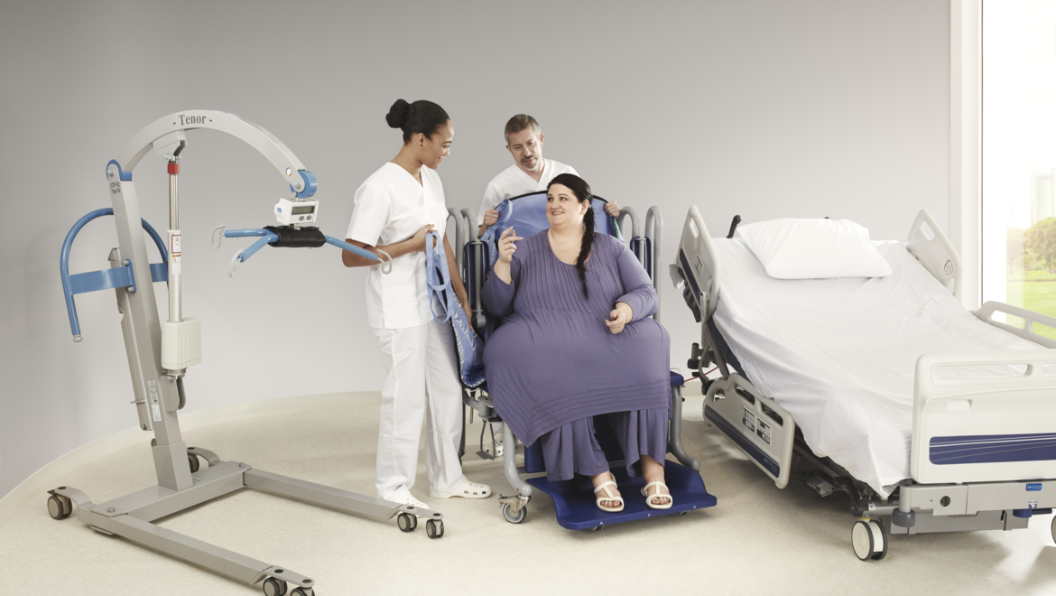
Bariatric room solution
Our Bariatric Room Solutions ensure your healthcare facilities are equipped for the increasing challenges of bariatric patients and ready to deliver safe, cost efficient and dignified patient care.

Caring for Plus Size Patients
Our Bariatric Clinical Focus Guide highlights factors to consider and helps you identify equipment that may be required to support bariatric patients with different levels of functional mobility.
_Blog%20Image_PNG.png)
ICU Early Mobility Webinar Series
Arjo Early Mobility Solutions enable you to mobilise patients in ICU early, often and at a secure and optimal level of functioning, helping you improve outcomes and maximise efficiencies. We invite you to join the upcoming webinar series in which we will discuss and review the physiologic benefits of early mobility in the ICU through evidenced based practice.
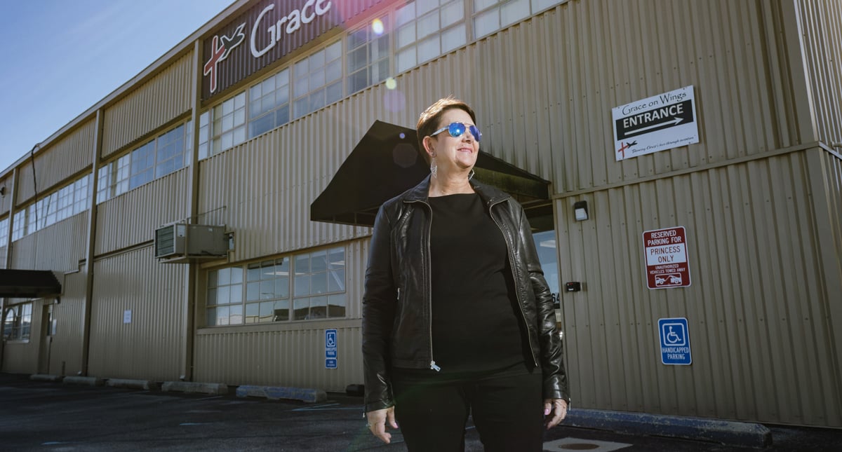
Teresa’s story of Empowering Movement
After living her dream to become a flight nurse for seven years, Teresa Switzer fell out of the helicopter while loading a patient. She was rushed to the ER with cracked ribs, fractured bones in her back and some nerve damage to a leg. The doctors told Theresa that she would never be able to work again.
| Top Left | Top Right | Bottom Left | Bottom Right | |
| Color theme | Blue Bg - White Text | Sand Bg - Lava Text | Wave 50 Bg - Lava Text | Flow Bg - Lava Text |
| Top margin | No margin | no margin | No margin | No margin |
| Layout | Top Image | Top image | Top Image | Left Image |
| Text horizontal position | Left | left | - | Left |
| Text vertical position | - | Top | - | Top |
| Text size | Normal | normal | Normal | Normal |
| Highlight background | Default | default | Default | Default |
| Button position | Left | left | Left | Left |
| Left/right image size | - | - | - | 1/2 |
| Style modifier | - | - | - | Full banner |
| Each Mosaic Card is set to Display As | Two thirds width (2/3) | One third width (1/3) | One third width (1/3) | Two thirds width (2/3) |

Patient Handling

Aiding the return to mobility

Empowering Movement
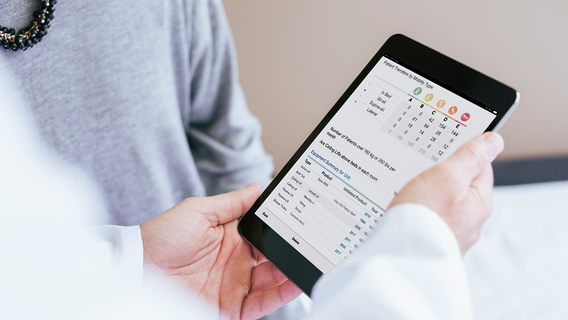
Product Information
| Top left | Top right | Bottom Left | Bottom Right | |
| Color theme | Blue Bg - White text | Blue Bg - White text | Wave AC Bg - Lava text | Sand Bg - Lava Text |
| Top margin | No margin | No margin | No margin | No margin |
| Layout | Top image | Background Image | Bottom Image | Top Image |
| Text horizontal position | Center | - | - | Center |
| Text vertical position | Middle | - | - | Middle |
| Text size | Large | Large | Normal | Normal |
| Highlight background | Default | White | Default | Default |
| Button position | Center | Right | Left | Center |
| Left/right image size | - | - | - | - |
| Style modifier | Round image | Box Shadow | - | - |
| Each Mosaic Card is set to Display As | One Quarter Width (1/4) | Three Quarter Width (3/4) | Two Thirds Width(2/3) | One Third Width (1/3) |
Contact Block
Contact Block
(Full width block)
Used for the bottom area of the page
- Image: 710x560px
- Header: 20 characters
- Description: 45 characters
Contact Popup Block
Contact Popup Block
(Full width block)
- Header: 45 - 85 characters
- Description: 250 characters
Two Column Rich Text Block
Where your contribution is valued
Arjo is a place where every initiative can have an impact. We are geared to empower each other in order to deliver greater value. Ultimately, we understand that we win or lose as one team. Because, when we work as a team, we can see the positive difference we make. Not just for our colleagues and teams, but also for the people facing mobility challenges and those who care for them.
Where you can be proud of your work
There is a clear connection between mobility and well-being – both physical and mental. Empowering Movement makes a profound difference. We experience it every day at work. Not only does it support the healing, dignity and independence of people facing mobility challenges, but also the confidence and overall well-being of their caregivers. We take ownership of every opportunity to focus on healthcare outcomes, which improve people’s lives and the communities in which we live and work.
Block styling
| Colo theme | Wave 50 Bg - lava text |
| Top margin | Margin small |
Video Text Block
Positioning solutions
With our prone positioning solutions, you can lower the risk of injury associated with prone positioning, and the number of caregivers and the physical effort needed to carry out a safe and controlled manoevre every time.
Block Styling
| Color theme | Blue Bg - White text |
| Top Margin | Margin large |
Two Column Text and Image Left or Right
_Blog%20Image_PNG.png)
Two Column Text and Image Block
- Image: 445x445px
- Header: 25 - 55 characters
- Description: 260 characters
Full width block
Top margin: Margin small
Image Position Left
No CTA

Covid-19
- Image: 445x445px
- Header: 25 - 55 characters
- Description: 260 characters
Full width block
Top margin: No Margin
Image Position Right
CTA
Testimonial Block
Repositioning dependent patients within their bed is the single greatest risk factor for musculoskeletal injuries for caregivers
Color Theme: Sand Bg - Lava Text
Repositioning dependent patients within their bed is the single greatest risk factor for musculoskeletal injuries for caregivers
Color Theme: Blue Bg - White Text
Top Margin: No Margin
Repositioning dependent patients within their bed is the single greatest risk factor for musculoskeletal injuries for caregivers.
Color Theme: Wave 50 Bg - Lava Text
Top Margin: Margin Medium
Repositioning dependent patients within their bed is the single greatest risk factor for musculoskeletal injuries for caregivers
| Number | Color theme | Top Margin |
| 1 | Sang BG - Lava text | No margin |
| 2 | Blue Bg - White text | No margin |
| 3 | Wave 50 Bg - Lava text | Margin medium |
| 4 | Pearl Bg - Lava text | Margin large |
Full Width Teaser Block
Block Information
| Image | 1920 x 730px |
| Header | 30 characters |
| Description | 240 characters |
Block Styling
| Color theme | Blue Bg - White Text |
| Top margin | No margin |
| Information Section position | Left |
Manually select Description text
for Related Product Block
Add an option for editor to choose one text field as the additional information of the product in the product list.
Configuration
In “Content” Tab of a Related Product block, select the property of Product.
If this value is not selected:
- For “Three columns with ‘Load more’” layout, the property value “Heading” in Dxp (Ingress in Inriver will be used.
- For Default view layout, additional information will be empty
Examples
- Three columns layout with additional information from “Long description“ property
- Default view (4 columns) with additional information from “Introduction” property
Related Products Block
Header: 30 characters
Block Styling
| Colot theme | Wave AC Bg - Lava Text |
| Top margin | Margin small |
Product Service Block
Our services
-
Service & spare parts
Professional maintenance and serving to help you get the most out of your equipment. We call it Arjo Care.
-
Clinical consulting
Results-drivent partnerships to create efficient environments that facilitate high quality care.
-
Rental & Pricing
Comprehensive solutions to ensure you have the right equipment at the right time.
Reference Block
-
Papazian, L., Aubron, C., Brochard, L., Chiche, J., Combes, A., Dreyfuss, D., Forel, J., Guérin, C., Jaber, S., Mekontso-Dessap, A., Mercat, A., Richard, J., Roux, D., Vieillard-Baron, A. and Faure, H., 2019. Formal guidelines: management of acute respiratory distress syndrome. Annals of Intensive Care, 9(1).
Full-width block
Reference text: There is no real limit on the amount of text when it comes to use of this block. Keep it precise and informative when writing the references.
Tab Container Block
Product Service Block
Buttons: Keep it short and sweet. It's a button.
Text and CTA Block
A partner offering complete solutions with guaranteed result
We help thousands of healthcare providers around the world to create the best conditions for patient mobility in care settings. Together with our customers, we analyse the unique requirements of each care unit and develop customized solutions that not just involve the right equipment, but also safeguards the care skills and work processes. As a mobility outcome partner working closely with customers, we are changing care practices, measuring and monitoring key performance indicators and guaranteeing improved clinical and financial outcomes.
Full-width block
Header: 50 characters
Text: Keep it precise and informative. There is no real limit on the amount of text when it comes to the use of this block. That being said, do not write just for the sake of writing. Always write with the user in mind.
Block styling
| Color theme | - |
| Top margin | No margin |
| Layout | - |
Five key benefits of our upgraded VTE prevention solution Flowtron® Active Compression System (Layout = 2 column)
A case study showed that 99% of the users considered the Flowtron ACS900 pump to be easy to use in general, easy to operate and easy to clean.³ The study was performed at 32 hospitals and demonstrated the clinical application of the Flowtron ACS900 and Tri Pulse garment range. User data from caregivers was collected in areas such as patient compliance, ease of use and safety
Several studies confirm noise levels in clinical settings to be unacceptably high, exceeding recommended thresholds consistently and significantly. With the growing amount of electronic equipment in care facilities, noise and alarms around patients’ bedsides are becoming an issue. 4 The Flowtron ACS900 pump measures significantly lower on both average and peak noise levels compared to two of the most recent and relevant competitive devices, proving its superiority
Full-width block
Header: 50 characters
Text: Keep it precise and informative. There is no real limit on the amount of text when it comes to the use of this block. That being said, do not write just for the sake of writing. Always write with the user in mind.
Block styling
| Color theme | - |
| Top margin | No margin |
| Layout | - |
Solution Area Block
| Image | 1920 x 640px |
| Header | 40 characters |
| Description | 250 characters |
Solution Area
| Header | 35 characters |
| Description | 100 characters |
Block styling
| Color theme | Flow Bg - Lava Text |
| Top margin | No margin |
Image Styling
| Custom class | - |
| Top margin | No margin |
| Picture profile | Default |
Two Column Text and List
Raising awareness for exploring new possibilities
-
Service & spare parts
Lorem ipsum dolor sit amet, consectetur adipiscing elit. Donec bibendum risus ornare, tempor erat a, porta felis. Fusce vestibulum laoreet odio, a posuere nisi posuere vitae.
-
Rental & financing
Lorem ipsum dolor sit amet, consectetur adipiscing elit. Donec bibendum risus ornare, tempor erat a, porta felis. Fusce vestibulum laoreet odio, a posuere nisi posuere vitae.
Block styling
| Color theme | - |
| Top margin | Margin small |
| Layout | No image |
| Text horizontal position | - |
| Text vertical position | - |
| Text size | Normal |
| Highlighted background | Default |
| button position | Left (No CTA) |
| left/right image size | - |
| Style modifier | - |
Story Text
Block styling
| Color theme | - |
| Top margin | margin small |
| Layout | background image |
| Text horizontal position | - |
| Text vertical position | - |
| Text size | Normal |
| Highlighted background | Default |
| button position | Left (No CTA) |
| left/right image size | - |
| Style modifier | - |
3 Column Editorial
Global news
Change in Arjo’s Management Team
Arjo’s year-end report January-December 2024
Arjo announces date for 2024 year-end report and conference call
Arjo introduces Symbliss – the next-generation integrated bathing system
Christofer Carlsson appointed interim CFO at Arjo

Annual Report
Block styling
| Color theme | Sand Bg - Lava Text |
| Top margin | Margin Medium |
Text Block
The power of movement
Research shows that there is a clear connection between mobility and people’s physical and mental well-being. Creating the best opportunities for mobility is therefore at the very core of providing high-quality care. We have seen how empowering movement can quickly improve both clinical and financial outcomes. As a leading specialist in the field, we work continuously to promote mobility – with the aim of contributing to better healthcare.
Block Styling
| Color theme | White Bg - Lava Text |
| Top margin | Margin medium |
Page List
Layout Settings
| Column size | Four columns |
| Grid display sort order | Ascending |
| Max grid items | 0 |
Block Styling
| Color theme | - |
| Top margin | no margin |
| Text size | Small |
Stock Details
Accordion Block
Our Bariatric Room Solutions ensure your healthcare facilities are equipped for the increasing challenges of plus size patients and ready to deliver safe, cost efficient and dignified patient care.
Our Bariatric Clinical Focus Guide highlights factors to consider and helps you identify equipment that may be required to support plus size patients with different levels of functional mobility.
Arjo Early Mobility Solutions enable you to mobilise patients in ICU early, often and at a safe and optimal level of functioning, helping you improve outcomes and maximise efficiencies. We invite you to join the upcoming webinar series in which we will discuss and review the physiologic benefits of early mobility in the ICU through evidenced based practice.
Empowering movement is at the heart of everything we do. It’s at the centre of our product design philosophy. It’s how we help care providers stay agile and efficient. It’s about enabling caregivers to move freely and productively. And for patients, it’s about enhancing mobility to promote healing, dignity and independence.
An accordion block is a collapsible item that expands when you click on it. By using accordion blocks, you can create sections that users can expand or collapse with a simple click.
A visual representation of the different banner sizing available
Language Selector Block
Example 1 - Auto Generated in 4 columns, rectangle icon
Example 2 - Manual List, in 3 columns, circle icon.
Block Description
The Language Selector Block is designed to display a list of language selection URLs with corresponding icons in a table format. Here's an overview of each property available in this block to guide you in setting it up and customizing it according to your needs.
-
Layout: 4 columns (default), 3 columns
-
Icon Type: Rectangle (default), circle
-
Link Target: Set the target URL for each link. The priority for the target URL is determined by the block's mode:
-
Manual Mode: Individual item URL if available, else fallback to block link target, then the current page URL.
-
Auto Mode: Uses the block link target first, then fallback to the current page URL if not set.
-
Note: if the Link Target has a specific language (not automatic) or is an external link the the same URL of Link Target will be use for every sub item (for example if the link target is www.google.com (external) or www.arjo.com/en-us/ (language specific) the all sub items will use that link)
-
-
Type: URL field.
-
Auto Generate List: If enabled, the block will automatically generate the list of links based on the region selection menu, ignoring manually added items.
-
Link Items: Manually add or edit the list of language links that will be displayed in the block. This option is only applicable if 'Auto generate list' is not selected.
Item in Language Selector Block
-
Icon: Set using the country code in lowercase, used as a CSS class for visual representation.
-
URL: If not manually set, the URL to link target of the parent block or the current page URL, adapted to the selected language.
-
Text: The display text for the language link, which can be localized.
-
Language Code: ISO code of the language, use to build URL from parent block’s link target or current page URL.
CTA buttons for Full Width Teaser Block
- CTA button background: set them for all button
-
CTA buttons: use “Call To Action Item Block” type, add/edit button in this Content Area, max is 2 buttons.
Interactive Map Block
Find our closest service station
Contact us for your servicing and repair needs
Lorem Ipsum has been the industry's standard dummy text ever since the 1500s, when an unknown printer took a galley of type and scrambled it to make a type specimen book.
Block Description
The built-in editor is called a “maker” or a “hotspot”, so these two concepts are used interchangeably in this guide.
This only applies to DxP images since we can’t add the maker to an external (e.g. QBank image).
Upload a new image or edit an existing image.
-
In the “Hotspots” tab, drag and drop a hotspot to create a new one
-
Select a block of “Text Block” type to add the text showing when hovering over the hotspot/marker
-
Or drag out to the trash icon to delete
The purple area of the editor is not being use (just adjust the location of the + icon)
Block Settings
-
Image max-width: To prevent large images from being used, the default width is 2000, for 2 columns view, should use 1200
-
Image with markers: could select Site Image with HotSpot
Block styling
-
Color theme: Standard Arjo theme, use with 2 columns view text.
-
Top Margin: Standard block to margin: No margin, small, medium, large
-
Marker shape and color: choose a style that best fits the context and background image
-
Map width: Full width will display block aligned with header and footer, Narrow view will display aligned with other standard blocks
-
Layout: image only or image with text side-by-side
Icon List Block
Lorump iplem
While healthcare facilities are aware of the risk of VTE, care providers do not always have the time, training or resources to implement optimal prevention strategies. With the Arjo Flowtron Active Compression System, professional caregivers can deliver safe, convenient and flexible VTE prevention therapy that helps them achieve compliance and optimal clinical efficacy.
BATHING AND SHOWERING
While healthcare facilities are aware of the risk of VTE, care providers do not always have the time, training or resources to implement optimal prevention strategies. With the Arjo Flowtron Active Compression System, professional caregivers can deliver safe, convenient and flexible VTE prevention therapy that helps them achieve compliance and optimal clinical efficacy.
Compression System
While healthcare facilities are aware of the risk of VTE, care providers do not always have the time, training or resources to implement optimal prevention strategies. With the Arjo Flowtron Active Compression System, professional caregivers can deliver safe, convenient and flexible VTE prevention therapy that helps them achieve compliance and optimal clinical efficacy.
An Icon List Block is a feature commonly used in content management systems to create lists where each item is accompanied by an icon instead of a traditional bullet point. This can make lists more visually appealing and easier to read. You need to ceate an Icon list block first which is the container of the icon item block.
It's important to note that there are additional design scenarios where adjusting various backend property values can help you achieve your desired design. Keep in mind the specific design you aim for. For other examples, please see below:
If you prefer your icon block without an image and like this display, select style 1 for the Icon variant. This style features a horizontal line followed by your title text.

- ICON BLOCK
- Icon Position - Logo on the LEFT
- Variant: Style 1
- ICON BLOCK
- Icon Position will not affect the result when you choose Variant style 2
- Variant: Style 2

- ICON BLOCK
- Icon Position: Logo on the Top
- Variant: Style 1
BATHING AND SHOWERING Title
- ICON BLOCK
- Icon Position will not affect the result as you choose Variant style 2
- Variant: Style 2
Video Block
- Full-width block
- Video format: 1920 x 1080px (HD)
Matrix Offering Block
Matrix Offering Block Properties
Matrix Offering Block Type
The Matrix Offering Block is designed to display structured information in a matrix format.
Properties of the Matrix Offering Block
Title: Main title of the block.
Subtitle: A subtitle to provide additional contextual details under the main title. This is a Rich Text field, allowing for formatted content.
Bottom Text: Text displayed at the bottom of the block, also formatted as Rich Text for enhanced formatting options.
Expand Button Alignment: Determines the alignment of the button used to expand each feature description.
-
Options: left, right.
Block Width: Sets the width of the block relative to its container.
Examples
-
Narrower view with feature button on the left
-
Full width view with feature button on the right
-
Options: 'Normal' for standard alignment with other blocks, 'Full Width' for an extended width that aligns with page headers and footers.
Content Levels
Define titles and backgrounds for up to five levels, each representing a tier or category of information.
Level 1 to Level 5 Titles: Title for each content level, provided as Rich Text for flexible formatting.
-
Note: Leaving the title field blank will hide the column for that level.
Level 1 to Level 5 Backgrounds: Background color for each level.
-
Options: Select from predefined color themes to differentiate between levels visually.
Matrix Content Area: Content area for placing matrix item blocks.
Matrix Item Block Properties
Title: Acts as the main identifier for the block, typically displayed as a heading or label.
Page Link: Allows linking to a related page, which can provide more detailed information or related content.
Information (Contact): Stores information in HTML format, allowing for rich text editing.
Matrix Item Block Level
Each level within the Matrix Item Block categorizes offerings into distinct tiers, each with a dedicated Text and Description property:
General Level Properties
- Text: Display in the cell.
- Description: Show as a tool tip when hover over the text.
Full Width Teaser Block with Movement Feature
Block Information
| Image Size | 1920 x 730px |
| Video Size | 1920x1080 |
| Header | 30 characters |
| Description | 240 characters |
Block Styling
| Color theme | Blue Bg - White Text |
| Top margin | No margin |
| Information Section position | Left |









_Full%20Bleed%20Flexible%20Desktop_PNG.png)


